Karsten Lehmann 8 September 2026 09:00:00
Mindoo Vega has been in Haven since the beginning, and for most of that time it was a modest thing: a mind map where every node is a MindooDB document, plus a Kanban board showing the same nodes as cards you drag between columns.
That was already more interesting than it sounds, because of what sits underneath. Two people can work on the same map at the same time - with the Sync page set to push changes the moment you make them and the server nudging the other devices over SSE, a node someone adds in Hamburg shows up in Frankfurt more or less immediately. Or you close the laptop, plan the whole launch on a train with no signal, and the two versions merge on the next sync instead of one of them winning.
This release is about what you can do with that data once it is there. It is the largest update Vega has had, and there is now a site of its own to go with it: mindoo-vega.com.
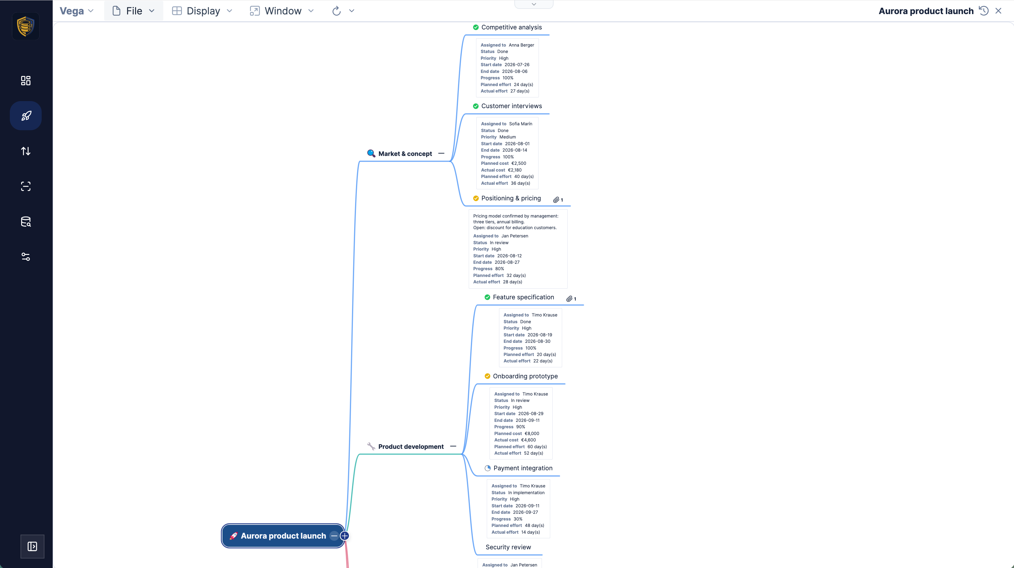
The point that has not changed
Before the list of new things, the idea they all hang off.
A node in Vega is an idea until you fill in the task fields on it - assignee, start and end date, priority, status, progress, planned and actual effort and cost, tags. The moment those are there, the same node is also a task. Nothing is copied anywhere. Kanban, Gantt and the spreadsheet are not exports of the mind map; they are the same nodes drawn in another shape, and a change made in one of them is a change to the node.
So you do not maintain a mind map and a project plan. The map is the plan.
A Gantt chart you can plan in
The obvious gap in a tool that already knew every task’s start and end date was the timeline. It is there now.
The Gantt view draws the schedule as bars on a weekly or monthly grid with a today marker. Drag a bar sideways and the dates move; drag its ends and the task gets longer or shorter - both of which are writes to the node, so the mind map and the board agree a moment later. The bars are coloured by status, and parent rows summarise their children.
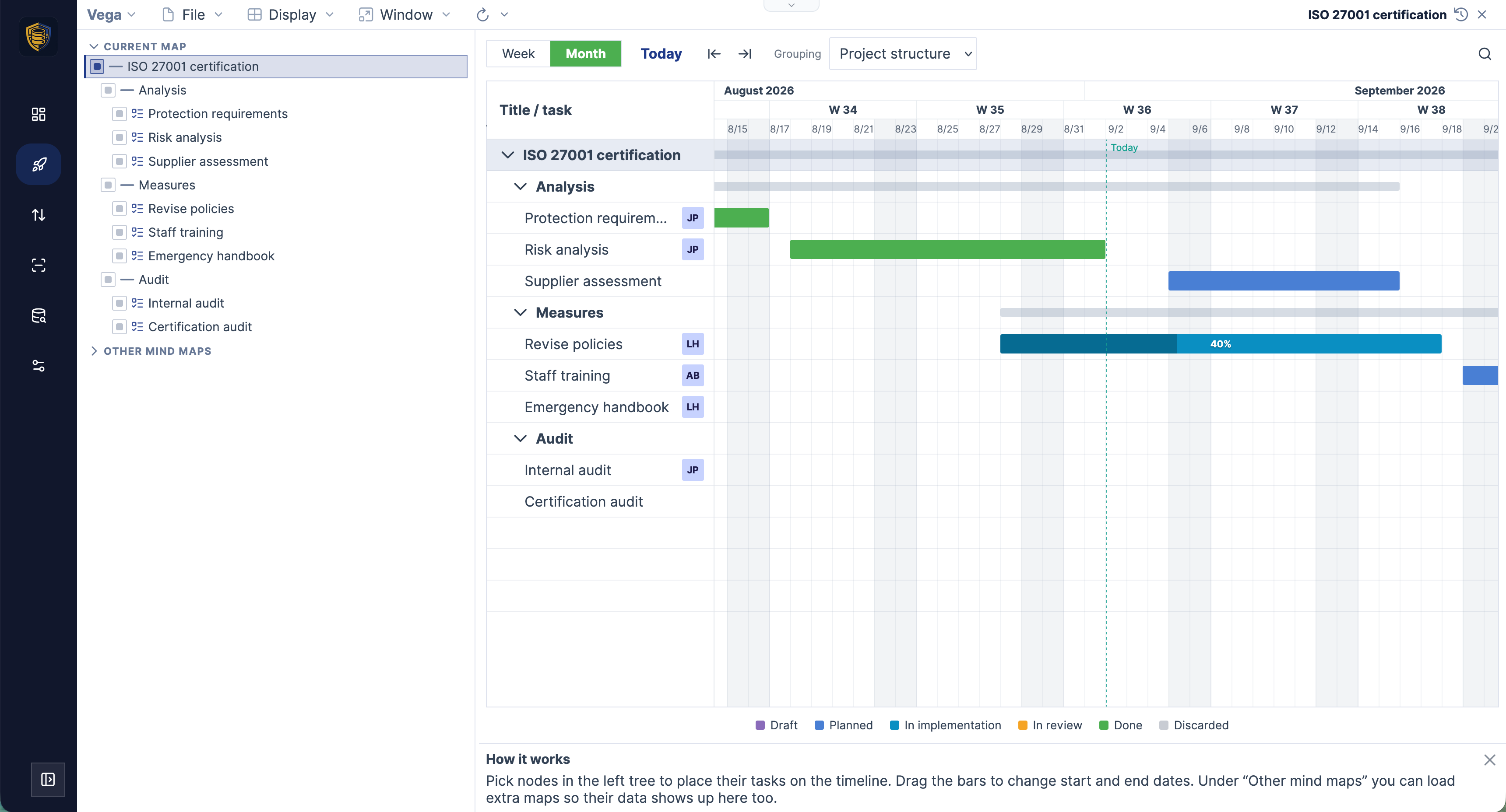
The Grouping selector is the part worth playing with. “Project structure” gives you the tree you built. But you can also group by resources, which turns the same timeline into a picture of who is carrying how much and when; by priority; or by tags.
That last one matters more than it looks, because Vega’s tags are hierarchical - nested with a backslash, so Team\Engineering stays a path rather than a flat label. The demo projects carry tags for team, company involvement, rooms and equipment, and grouping the Gantt by them shows a completely different cut of the same work: not the project breakdown, but which rooms are booked out in week 36, or how much of the plan depends on the agency.
Several projects in one timeline
The tree on the left of Kanban and Gantt is a selection, not a navigation aid. You tick the branches that should be evaluated - and they do not all have to come from the map you have open.
Three sources feed that list: the current map, other mind maps you load alongside it, and the maps your nodes link to. Ticking a few entries puts a launch plan, a website relaunch and a compliance project in one board or one timeline, while each of them stays its own document with its own encryption and its own history.
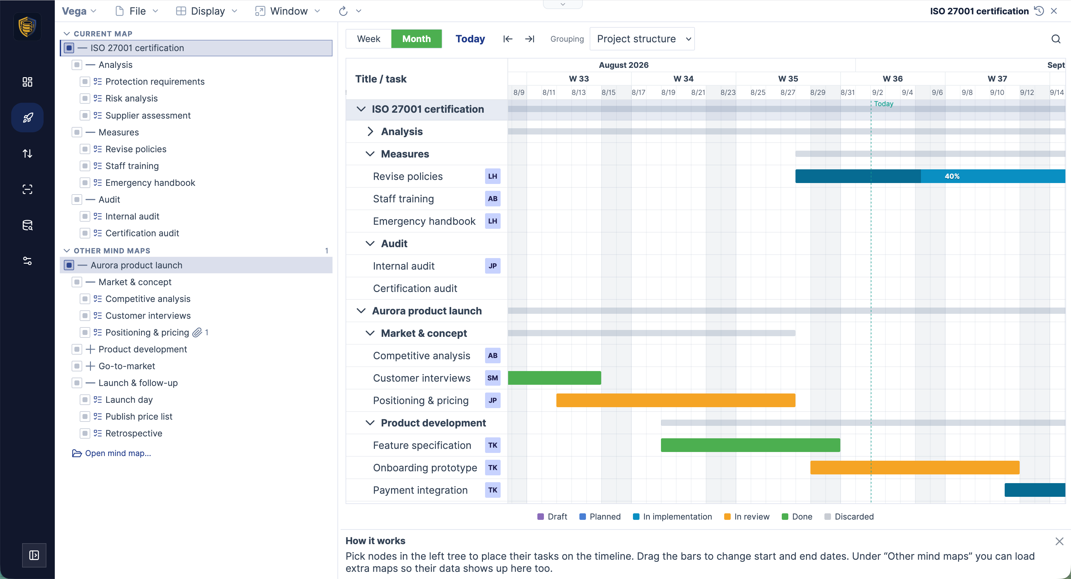
That is a portfolio view without a reporting tool and without copying nodes into a reporting map. Build one small map whose nodes are nothing but links to your projects, tick its entries, and you have a programme overview that never goes stale - because it is not a copy of anything.
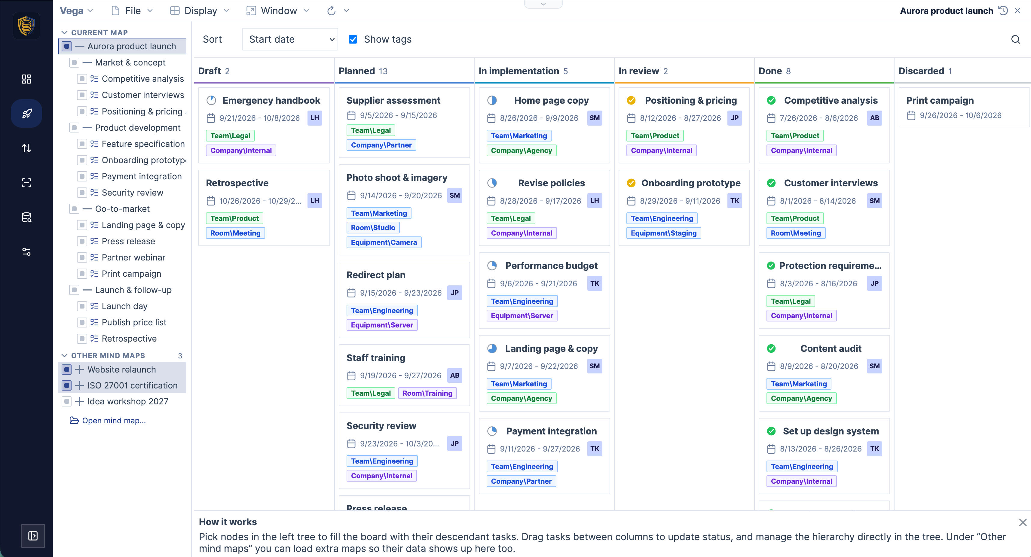
The same selection drives the Kanban board, which also learned to show the tags on the cards.
A spreadsheet, on your project data
This is the big one, and it comes from somewhere.
In May we shipped Mindoo TeamGrid, the collaborative spreadsheet for Haven: about 280 Excel-compatible functions from fast-formula-parser, several worksheets, charts, and XLSX import and export that survives a round trip. Vega now carries that same editor - and points it at your project nodes.
Here is how it works. You tick the branches to evaluate on the left, exactly as for Kanban and Gantt, say whether tasks, linked nodes or all nodes count, narrow further with a search term, and choose which fields become columns - subject, notes, assignee, status, progress, priority, the dates, planned and actual effort and cost, currency, tags, link target, path, root subject, node id. Then you say where the block starts, for example B5. From that cell down and to the right, Vega owns the sheet and rewrites it whenever the selection changes, so the numbers are never stale. Above and to the left of it, the sheet is yours: headings, your own totals, other worksheets, formulas and charts all survive every refresh.
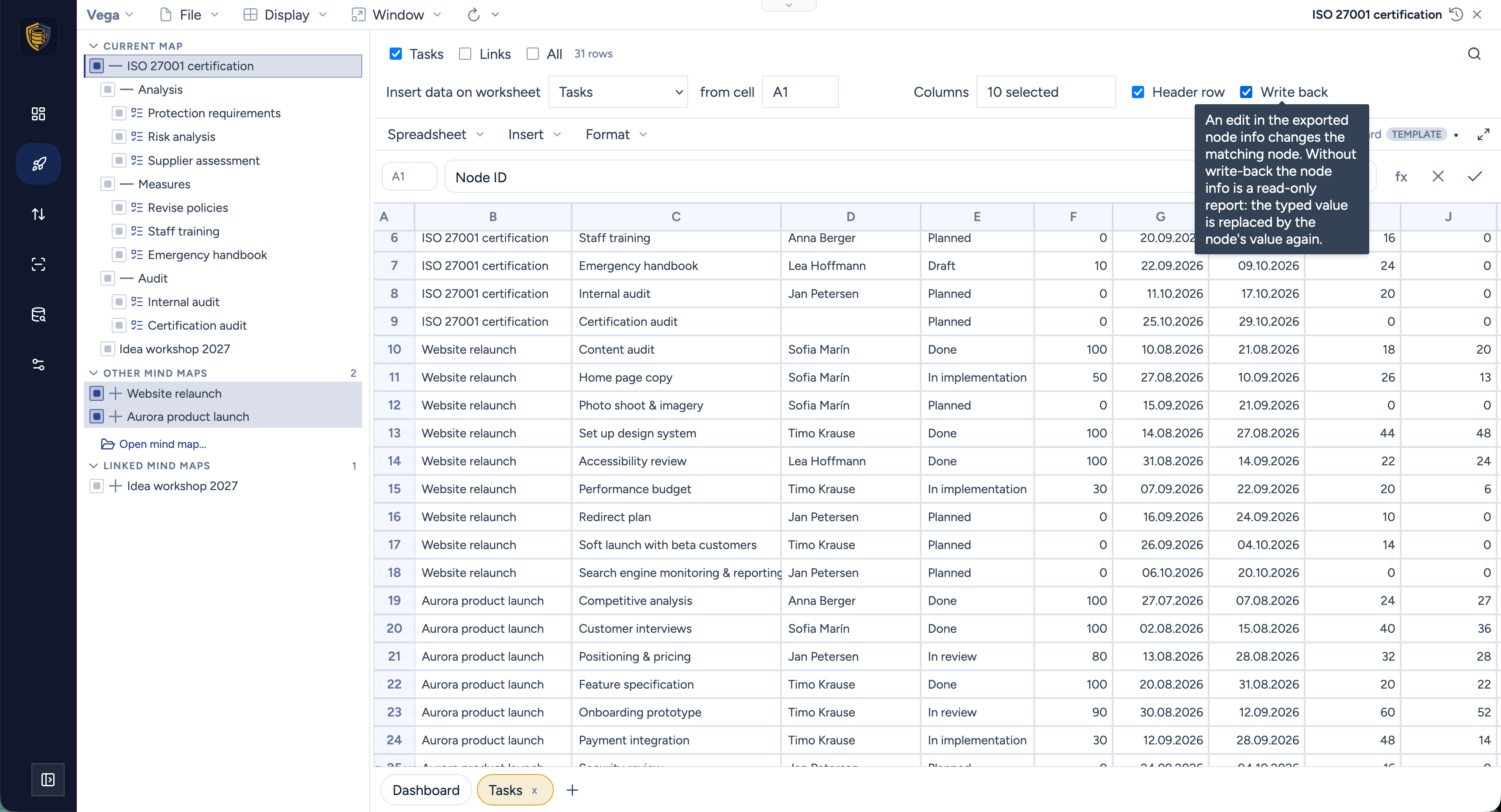
And then there is the Write back checkbox in that toolbar, which began as a slightly mad question over coffee: we had built the mapping in one direction, so how far would it go if we ran it backwards? It went the whole way. With write-back on, editing a mapped cell changes the node. Re-plan a phase by typing new end dates down a column, reassign eight tasks by dragging a name down, bump a set of statuses - the mind map, the board and the Gantt have all moved by the time you look at them. Switch write-back off and the block is a read-only report again; a value you type there is simply replaced by the node’s own on the next refresh.
Everything else that was true of a TeamGrid workbook is still true here. Formulas reference the block like any other range, so =COUNTIF(...) over a status column or =SUMIF(...) over the effort column does what you would expect. Insert puts a column, bar, line or pie chart on the selected cells. Virtual views can pull in data from elsewhere in MindooDB entirely. And Export → XLSX hands the whole workbook - charts included - to a colleague who lives in Excel and has never heard of us.
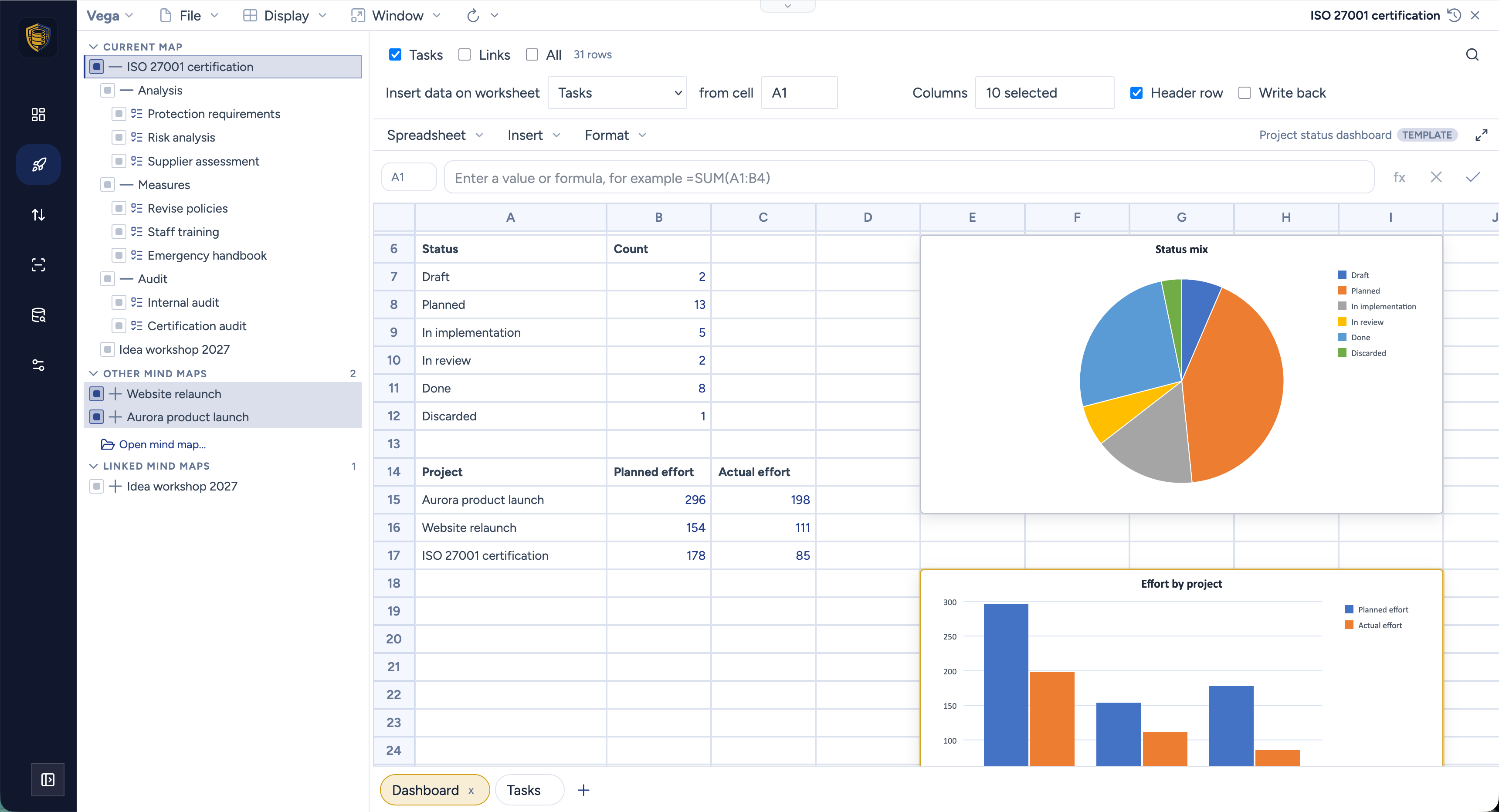
A spreadsheet is its own document, with its own database, title, tags and encryption recipients - it may well live somewhere other than the maps it reports on, and it leaves those maps alone. Save one as a template and the block is stored empty, so the next project fills your dashboard with its own work. Three of them ship with the demo data: a status dashboard, a budget report, and a period comparison.
The project as it was in July
MindooDB never overwrites anything, and Vega now spends that history on project reporting.
Time travel opens the map at an earlier date, read-only. The mind map, the Kanban board and the Gantt chart all follow the same slider, so you can look at the plan as it stood at the kickoff, or the board as it looked before the reshuffle nobody wrote down.
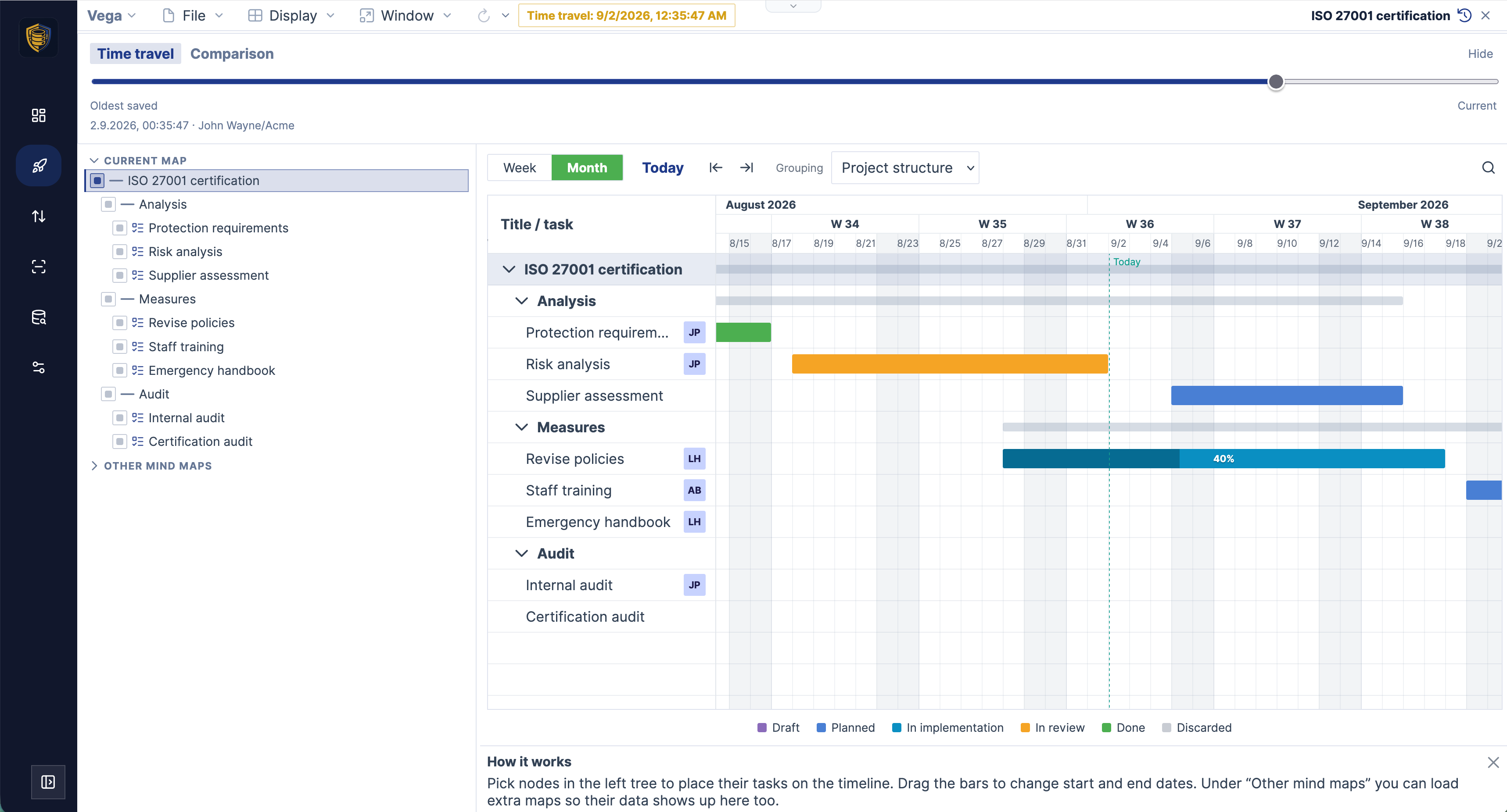
Comparison puts two of those moments side by side. Planning tools generally do this against a baseline - a snapshot somebody had to think of saving at the time, and the only version of the past you get to look at afterwards. Vega needs no baseline, because the whole history is there: pick any two dates and it lists which nodes were added, removed and changed between them - titles, task data, notes, appearance - with a summary of how much of the tree moved. It covers every branch you have ticked, across several maps at once, and the revisions of all of them merge into one timeline so any save anywhere is a point the slider can stop at.
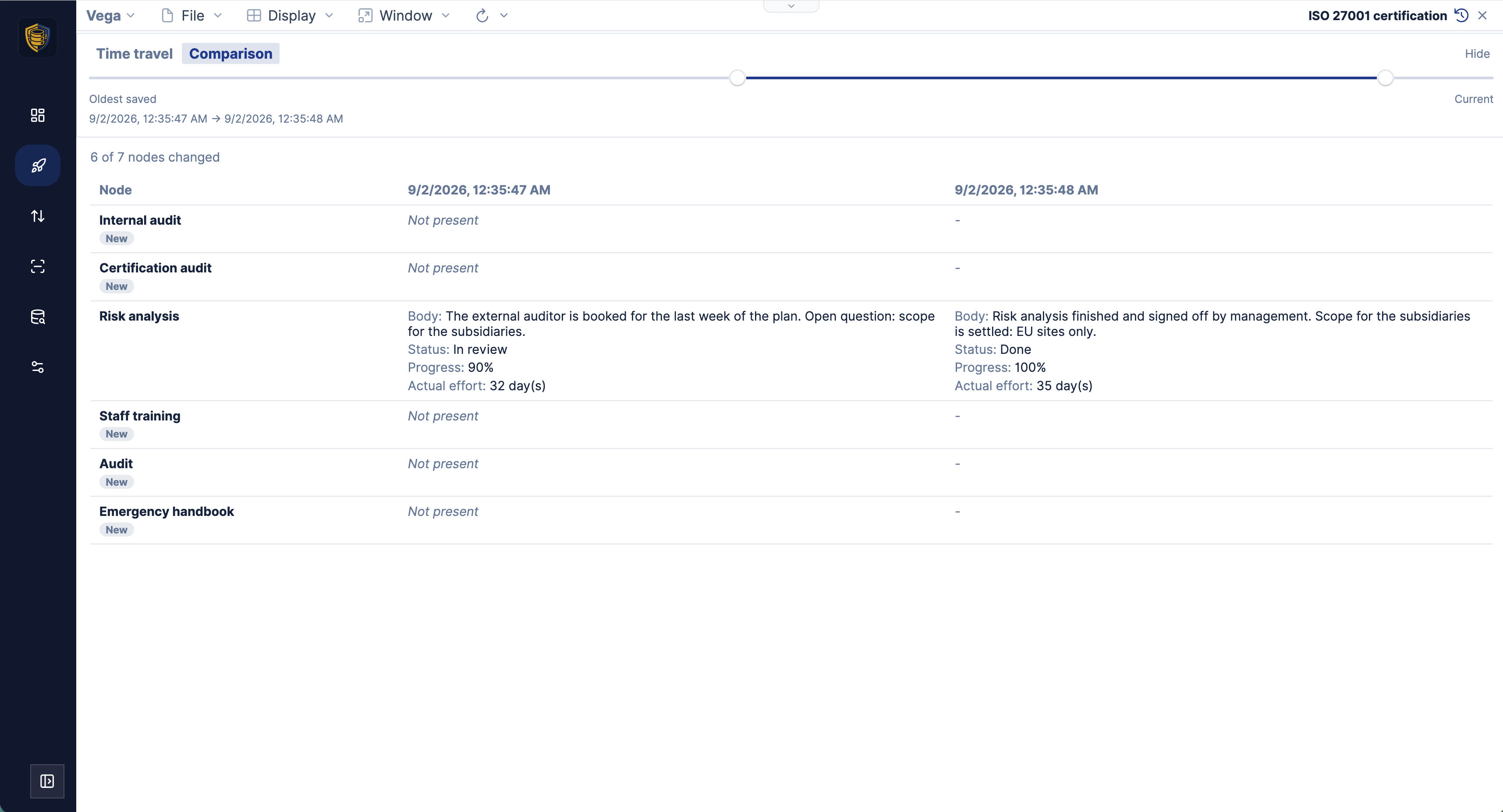
When someone asks what slipped since the kickoff, that table is the answer. When they want it as a report, there is a second answer.
Comparison spreadsheets, with the XLOOKUPs already written
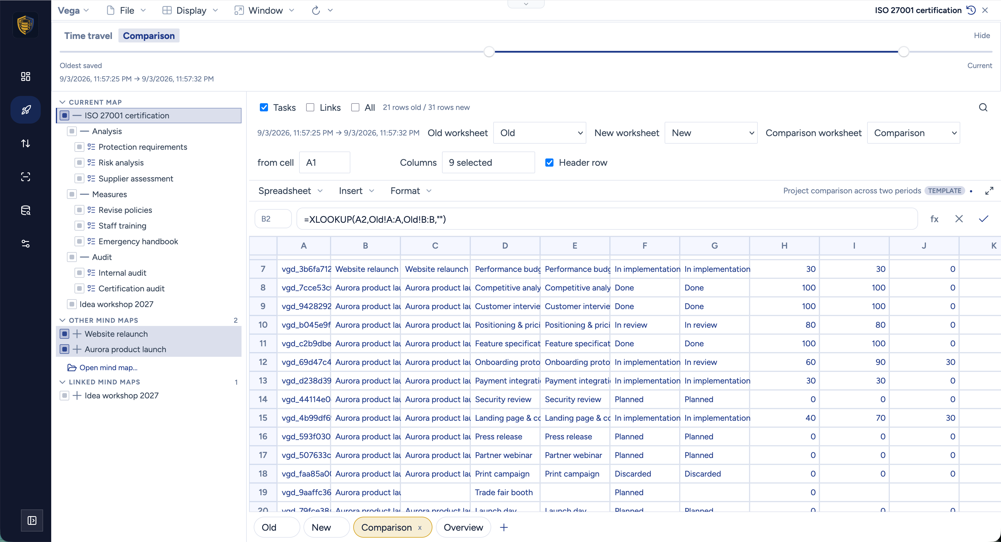
A comparison spreadsheet is a sheet document with two data blocks instead of one. “Old” is filled from the earlier end of the history span, “New” from the later end, both following the branches you ticked, and neither of them writes back - historical rows have no business overwriting live nodes. The span comes from the History panel, so moving the slider refills both blocks.
The third worksheet is where it becomes a report. Vega pairs the two blocks by node id and generates the comparison for you: every field as an old and a new column, plus a delta column wherever the field is a number, so new − old is already there for effort, cost and progress. The formulas are Excel’s own, under their English names - XLOOKUP with all six arguments, MATCH, INDEX - which means the workbook still means the same thing after an XLSX round trip on somebody else’s machine. Below the generated rows the sheet is yours, and your own formulas stay put.
The fourth worksheet in that shipped template is the one nobody generated. “Overview” is an ordinary sheet with your own formulas on it, reading across from the two blocks: planned and actual effort, planned and actual cost, old against new with the difference beside them, and a chart on top. Vega does not touch it on a refresh, so it keeps meaning the same thing when you move the slider to a different pair of dates.
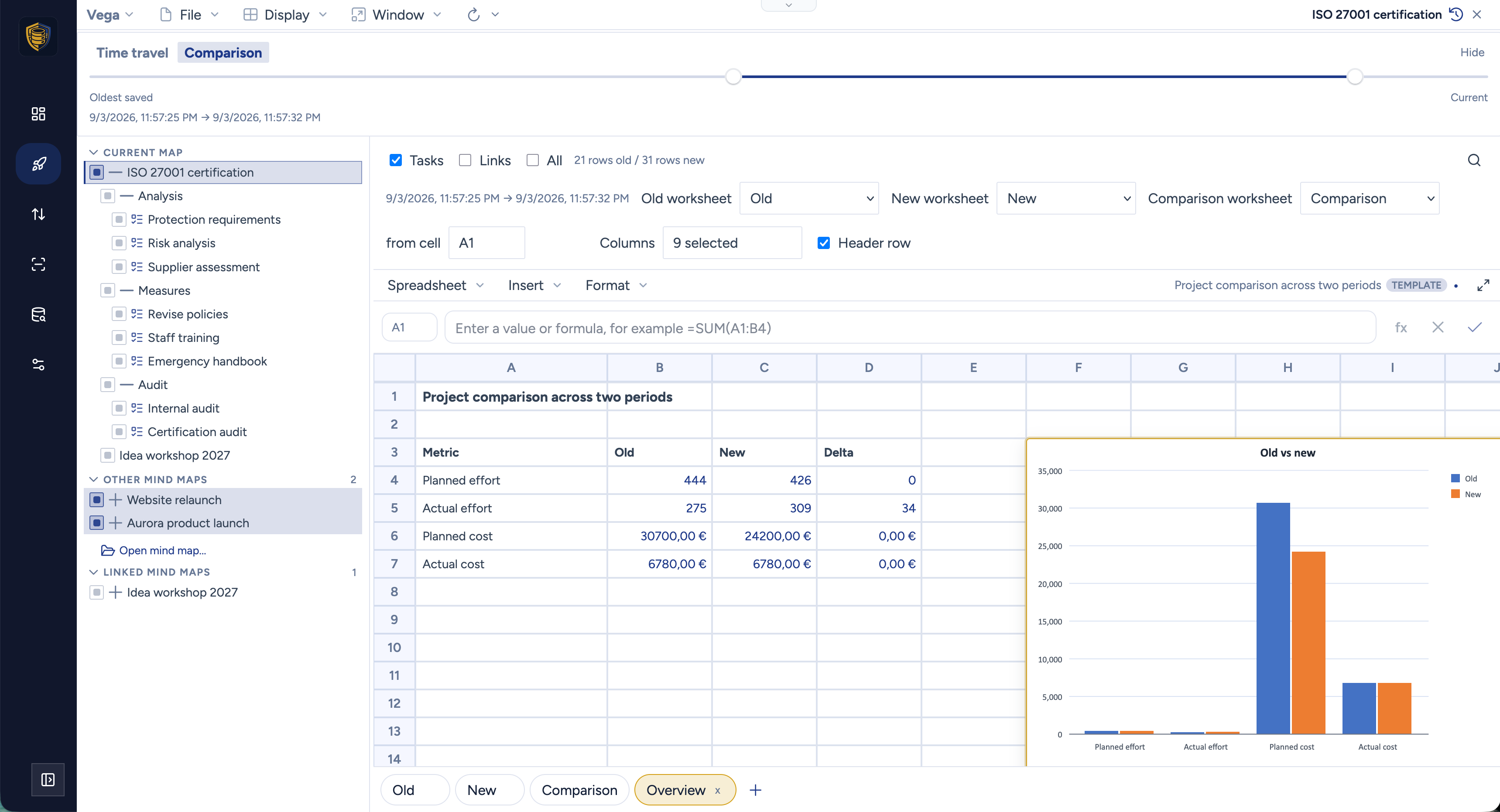
Two dates in the past, or the past against today, with charts on top: that is a period report on an encrypted project, produced without exporting anything to a reporting system.
On the wall
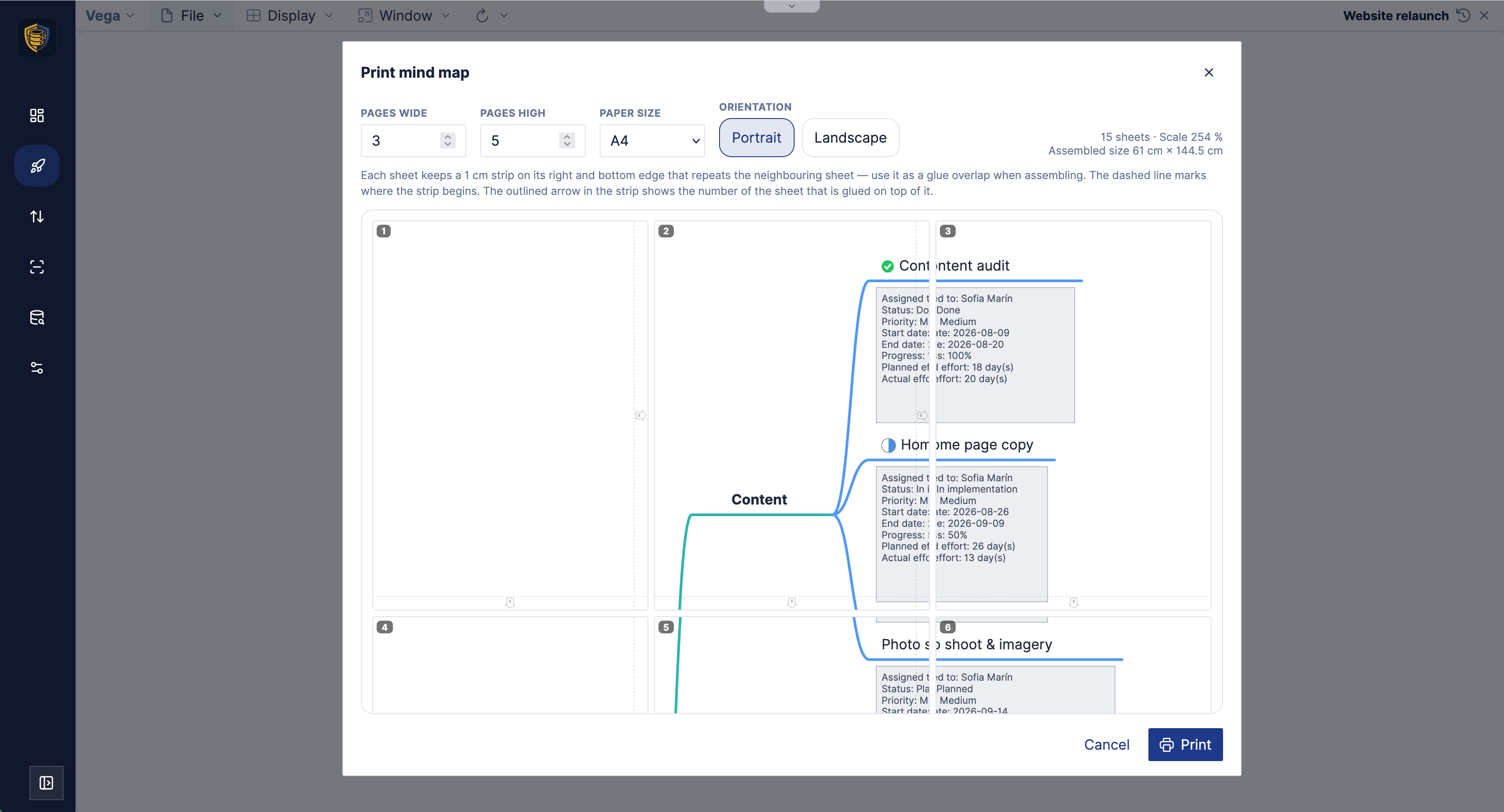
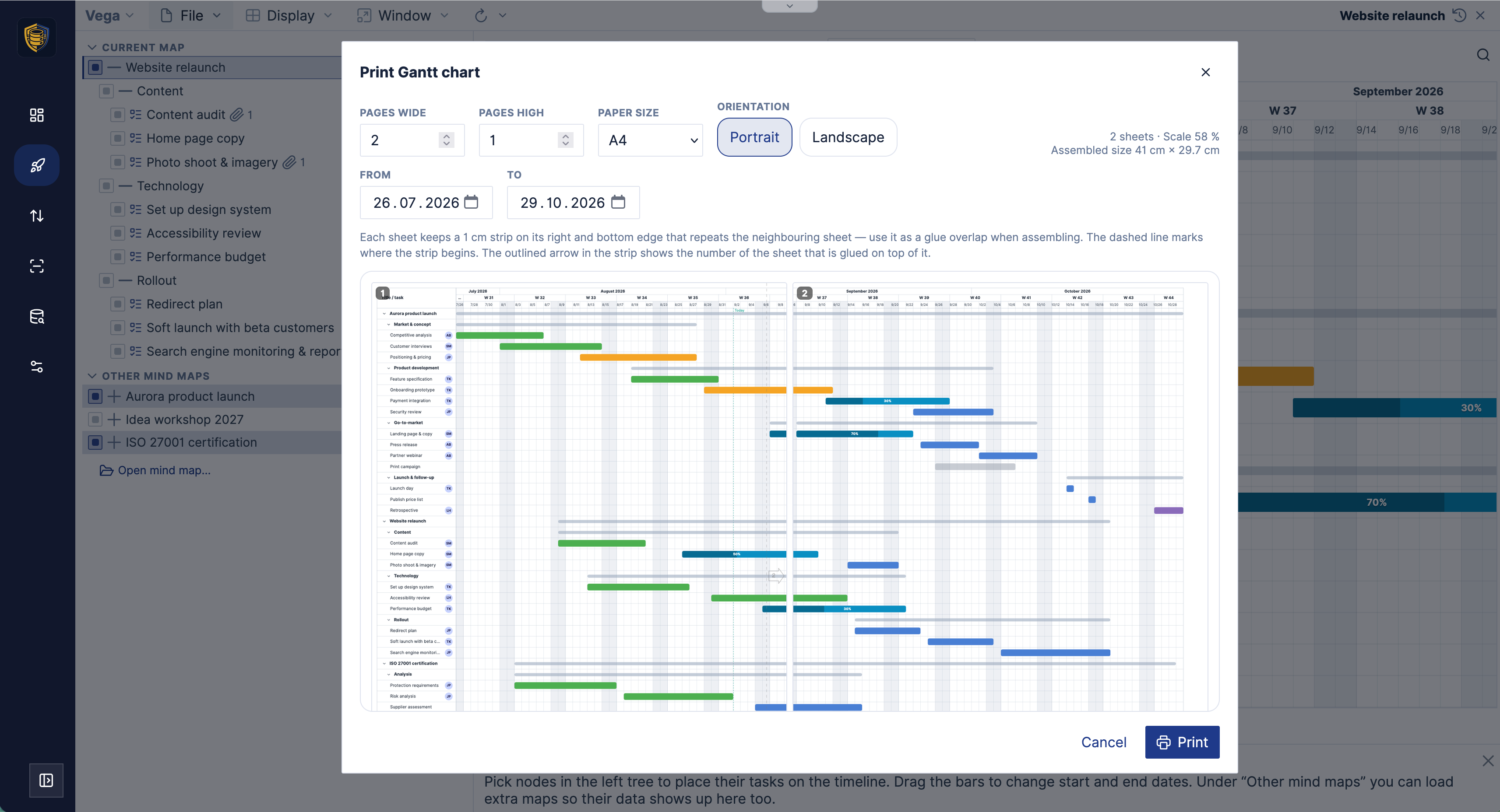
Digital views are fine until the team is standing around a table. Print tiles a mind map or a Gantt chart across any number of sheets - you pick how many wide and how many high, A4, A3 or US Letter, portrait or landscape, and for a Gantt poster the time range as well.
Every sheet carries a 1 cm glue strip on its right and bottom edge that repeats the neighbouring sheet, with the number of the sheet that goes on top of it printed in the strip, so assembling a 3 × 5 wall of paper is not a puzzle. The dialog tells you what you are about to make before you commit to the paper: number of sheets, the scale it needs, and the assembled size in centimetres. File → Export still writes the map as SVG, a single-page PDF, or an OPML or Markdown outline.
The Gantt poster adds a from and to date, which is the setting that decides whether the wall shows this quarter at a readable size or the whole project at a glance. Below, three months of a website relaunch across two A4 sheets - a 41 cm strip of timeline for the wall next to the desk.
Links, out of the map and out of the tenant
A node can now point at another node - inside the same map, in a different map, in a different database, and across a tenant boundary. A risk in the compliance map points at the launch task it endangers; a design brief opens the matching page in the website map. Or the link is a plain URL instead: the spec on the intranet, the ticket in the tracker, a mailto: for the owner.
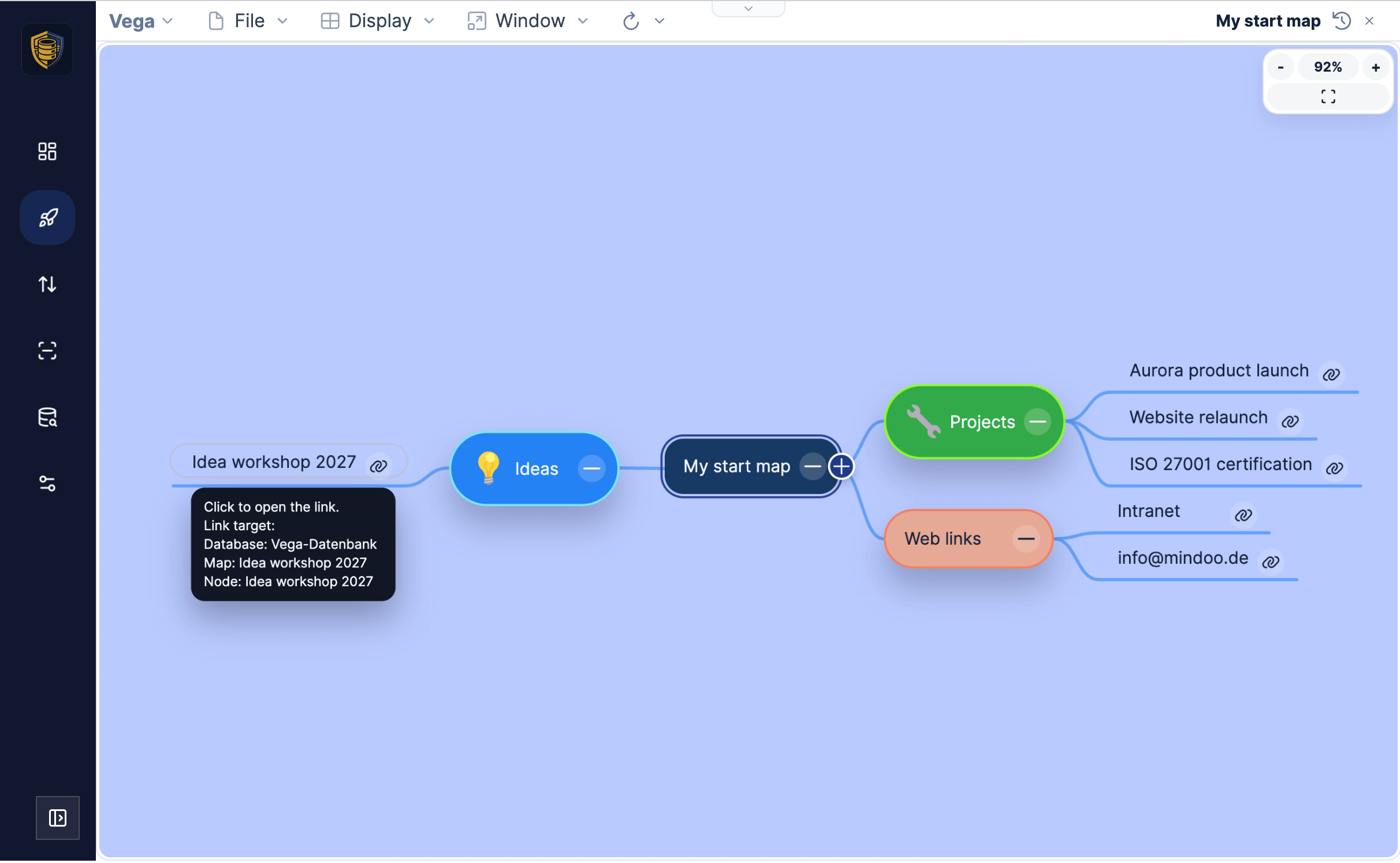
That is how you show cross-relationships without merging everything into one enormous tree - and, as mentioned above, how a map of link nodes turns into a portfolio that Kanban, Gantt and the spreadsheet can all evaluate.
The smaller things
A release like this is mostly made of these.
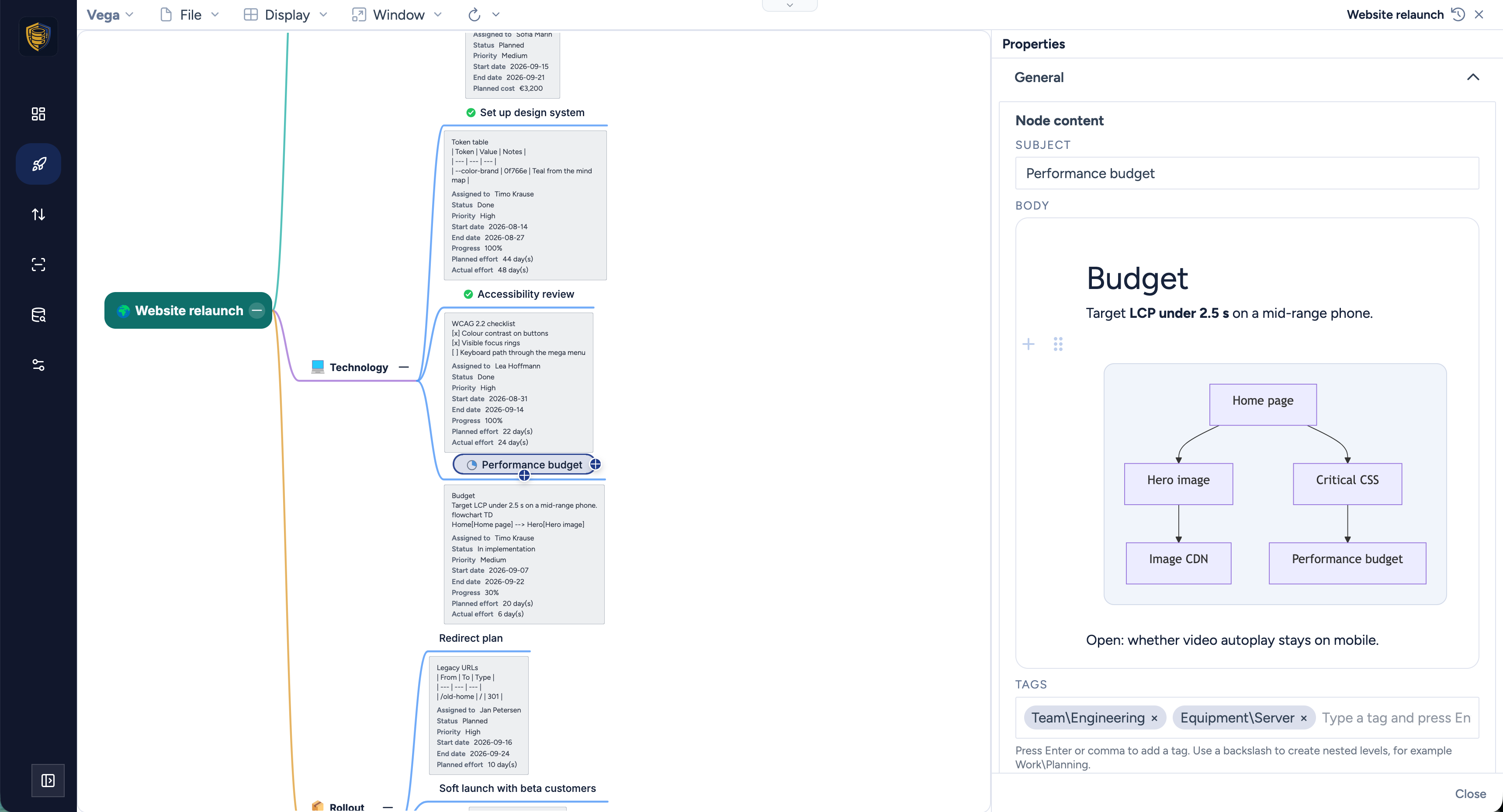
The properties panel can be docked. Instead of a dialog that opens and closes on every node, pin it to the right of the workspace with Display → Properties sidebar or Alt+Shift+Enter. It follows the selection and remembers its width. The Markdown editor for the node’s notes sits in there - headings, tables, checklists, images, links - and renders Mermaid diagrams where you wrote them, so a small flowchart lives on the topic it explains rather than in a wiki nobody opens.
Node icons. There is a library to pick from, and you can upload your own images when the library does not have what your team means.
Layout and styling. The mind map layouter got a rework, and nodes gained more visual styles and fonts - colours, shapes, borders, alignment, opacity, callouts for the branch that needs attention.
Editing several nodes at once. With a multiple selection, Properties edits tags and task fields for all of them; where values differ you see Multiple values rather than a misleadingly empty field, and mixed fields you leave alone are not overwritten.
Templates. Mark a map as a template and it turns up under New from template…. The tree, notes, styling and task fields are copied into a fresh map - and the template may live in one database while the new project is created in another, with its own encryption recipients and tags. If your projects always start with the same phases and the same review gates, that is the company path, kept in one place.
Attachments and notes, as before, sit on the node itself and travel with it, encrypted like everything else.
Still nobody else’s business
None of this changes the foundation. Content is encrypted on the device before it is stored, so the operator of the server - including us, when that is us - holds ciphertext and nothing more. When you create a mind map you decide who may decrypt it: a shared key when the audience is a role, or a recipient list of names when it is three people. That covers the tree, the Markdown notes and every attached file.
Which is worth saying out loud in a post about project management, because a project plan is a fairly complete description of what a company is about to do and who is doing it.
Trying it
Vega is free, and it is a one-click install from the Haven App Store - pick the tenant that should hold your maps and it opens ready to use.
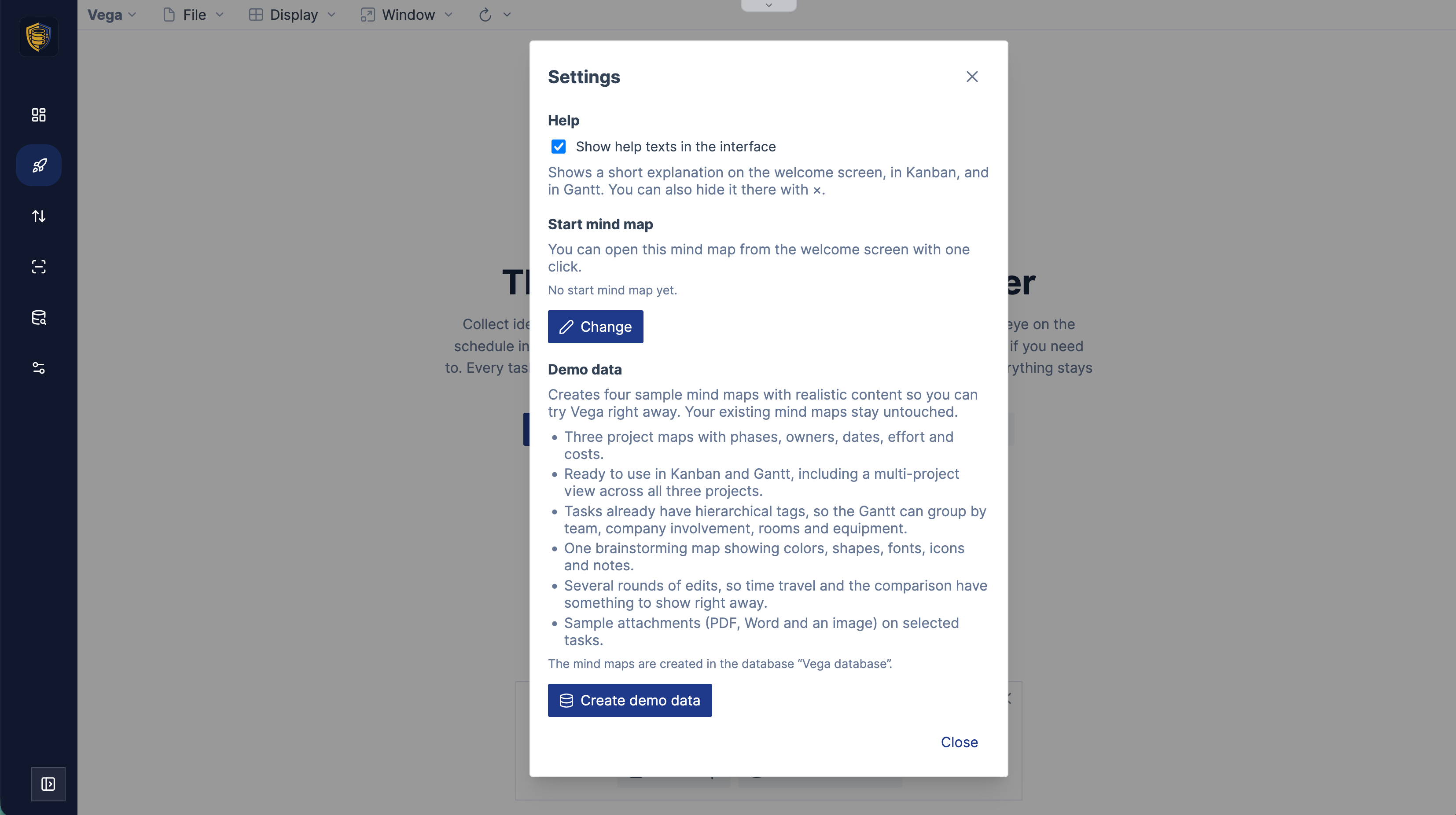
Then go to Vega → Settings and press Create demo data. It builds four sample mind maps - a product launch, a website relaunch, an ISO 27001 certification and an ideas workshop - with realistic phases, owners, dates, effort and costs, hierarchical tags for team, company involvement, rooms and equipment, sample attachments, and several rounds of edits so that time travel and the comparison have something to show immediately. Three spreadsheet templates come with them. Your own maps stay untouched.
Ten minutes with that data set is a better description of this release than this post is: brainstorm a branch, fill in a few task fields, watch it appear on the board and the timeline, tick a second project into the selection, mirror the lot into a spreadsheet, type into a cell and see the node change, then pull the history slider back and look at where the plan started.
The full tour, in all eight languages Vega speaks, is on the new site at mindoo-vega.com. Vega runs on Haven; MindooDB Cloud is the managed sync layer that keeps your encrypted content in step across devices and covers every Haven app, at €7.99 per user per month or €79.99 per year - the details are on the pricing page.
Haven Community remains free to use for private and commercial projects at haven.mindoodb.com. MindooDB itself is open source under the Apache 2.0 licence, and everything else is at mindoodb.com.